Tips and Tricks from Steve Krug’s: Don’t Make Me Think
I aspire to become a UI/UX Designer, among other things. This recent project of making a mobile app for New Intelligence where the entire game is essentially UI, would make a great opportunity to learn important theory and application for good UI right?
Unfortunately I didn’t get to finish the entire book (as of yet), but there are still very important insights that I’ve taken away. Steve says at the start of the book that a lot of what he talks about isn’t going to blow your mind, in fact you probably already know a lot of it. I find that he phrases and presents this already found knowledge in very meaningful ways that really sends it home and makes it blatantly obvious. Like looking at every day things that we see and then getting a microscope and seeing things in a different light. And while this book was originally about Web, it’s been adapted for mobile as well, but can still transfer the principles to general UI design.


A few notes.
The number 1 rule, which is also the title of the book “Don’t make me think”. Making a page self-evident is like a store with good lighting, or in this case, good level design with good lighting, guiding users. And a prime example of this, was recently when I started to play Black Desert Online. There’s no tutorial on the UI, and with the amount it shoves in your face, it needs one. You get dropped in the deep end and start drowning. Well that was my experience anyway. And this is coming from a veteran of World Of Warcraft. The UI is same-same but different. Same conventions, but BDO has a little bit more complexity and depth.
I don’t expect you to watch this video, just mute the audio and have a flick through to get a feel for the amount it shoves in your face. And by no means does this video cover it all. My point is though, Black Desert Online, even though using general conventions, had so much complexity and wasn’t easy to decipher, it was constantly making me think. To the point where I was actually getting frustrated. To the point where I stopped playing. Call me crazy, shake your head and tell me that doesn’t happen, but it does. I’ve installed countless apps where I’ve done the same because of bad UI design. It leads (but does not always) to bad user experience. And as Steve says “If there’s good navigation, users have a good impression and start to trust”.
- Don’t re-invent the wheel! Use Conventions – It’s a risk vs reward type scenario.
- We parse visual hierarchies so fast. We only recognise that we do it when we can’t do it.
- Work most magic at a glance, most people spend less time looking at it than we think.
- People rely on cursor change to tell whats clickable.
- Highlight where we are in navigation – in tabs too.

- Avoid wall of words.
- Design for scanning – not reading.
- Take advantages of conventions.
- Create effective Visual Hierarchies.
- Break up pages into clearly defined areas.
- Make it obvious what’s clickable.
- Eliminate distractions.
- Format content to support scanning.
- Every page needs a name.
- More importance = more prominence.
- Prominence, grouping, nesting.
- Consistency – BUT – CLARITY trumps consistency.
Usability
- Useful – Does it do something people need done?
- Learnable – Can people figure it out and know how to use it?
- Memorable – Do they have to relearn it each time they use it?
- Effective – Does it get the job done?
- Efficient – Does it do it with a reasonable amount of time and effort?
- Desirable – Do people want it?
- Delightful – Is using it enjoyable or even fun?
Trunk Test
A simple test to perform on web sites, possibly within games or apps.
- What site is this?
- What page am I on?
- What are the major sections of this site?
- What are my local navigation options?
- Where am I on this page?
- How can I search?
Application
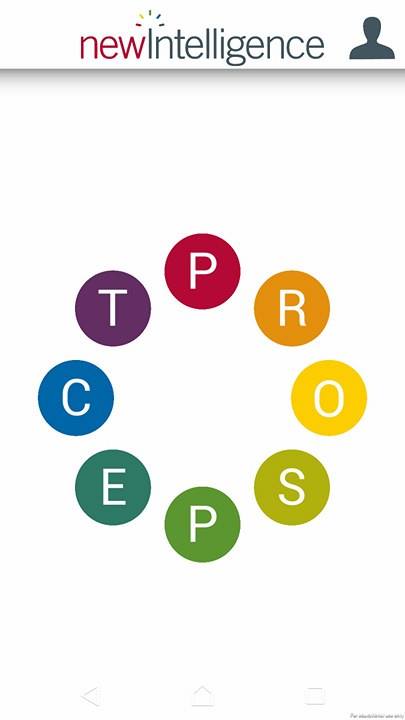
The main screen is comprised of a minimal amount of things. The title of the game/company name. The game doesn’t actually have a name, it’s just called the ‘New Intelligence App’. Because like Krug says, every page needs a name and the more importance the more prominence. Although it is the newIntelligence logo, it’s a branding thing, this is the app for their company, plus it tells you what app you’re in. Originally there was a screen before this that had the NI logo and a button that said start which would bring you to this screen. It was removed because – when a user opens the app, we don’t need them to ‘start’ the game, they just opened the app, they’ve already started. Having the start panel/page there is a needless and time-wasting interaction and it didn’t add anything to the game.
It also has nested among it a picture of a ‘head shot icon / profile’, rather than the word ‘profile’. Which can be conventionally identified to have the functionality of a profile and the details in which it may contain user specific information. When it comes to scanning, not only does the icon take up much less valuable screen space, it can be condensed to a very precise location that works within the limitations of the banner space and more hastily and easily identified. Scaling text large enough so it’s legible but to fit within that small amount of space would clutter the banner and detract from the prominence of other elements. Scaling the text too small so it doesn’t clutter the rest of the banner and still works to the prominence and grouping conventions, but makes the word illegible.
The last element on the screen is rounded PROSPECT model that unfolds each time a user enters this panel. Each of the prospect model letters are a button that navigates into the appropriate panel. “Transformation is the most discernible, largely because it stands out. A ‘submit’ button changing shape to become a radial progress bar and finally changing shape again to become a confirmation check mark is something that we notice. It grabs our attention, tells a story, and has completion” (Willenskomer, n.d.). The intent behind having the PROSPECT model unfold is to grab attention and make users want to interact with it.

How do we read? From left to right. How do analog clocks display the time? The PROSPECT model unfolds from left to right, so as conventions have already taught – not to mention in the ways that the letters unfold, users should already understand how to read this transformation. I’ve they’re using the app, they’ve also already undergone training with New Intelligence and understand what the PROSPECT Model is. Although they are only circles with letters in them, nothing up until this point has led users to understand that these letters could be pressed. Among only having the game title and a profile picture, there’s not much else to draw attention, at this point everything could look like it can it pressed, everything could look like it can’t.
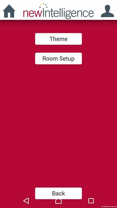
The only difference between the letters of the prospect model and the profile icon (which are the only interactable elements on this panel) is that the profile icon doesn’t have a backing image to keep it consistent with the conventions of what other interactable elements are in the game. The reasoning behind that was because as I mention in my post-mortem, I had to step away from this project for a time and someone else took the reins of lead UI designer (Josh). I’ve asked Josh and his reasoning was he was doing less outlines in general. He updated all of the conventional banner buttons (home, back, exit activity, profile) to be just the necessary icon. The touch zones are larger than the icons to allow a larger space for touch functionality. He said it just seemed like unnecessary contrast when we already have the white bar and it allowed the icons on the buttons to be bigger.
When inside of any part of the PROSPECT model, the colour of the background is the same as the letter. Although it’s a straight panel swap because time didn’t allow for super juice, I think this is a fantastic and easy way to identify where the user is within the app due to recent selection. It eliminates the need for a title “YOU ARE HERE” and the colour contrast works really well. If we had more time, it would have been really nice to be able to transition between those panels through watching the PROSPECT model button’s colour fill the screen and the elements transition in and out where needed.
But much like the last screen, not much has changed. There are buttons to choose from to take the user into an exercise, and the profile button is still in the top right. In face that profile button’s location never changes and is always there. Consistency and clarity. Wherever the user is in the app, in the top left of the screen (or the left side of the banner) is a button that takes them to the previous panel. Like the back button for and internet browser (the most used button). Except within the app the icon changes according to where the user is. If in an activity like the photo above, it’s a home icon to represent going back to the home page. If the user is in an exercise like the next photo it’s an X icon to represent exiting that exercise. The functionality remains the same but the visual distinction is different because it has different consequences within each panel. And the icon’s are easily recognisable to reduce the amount users have to think.
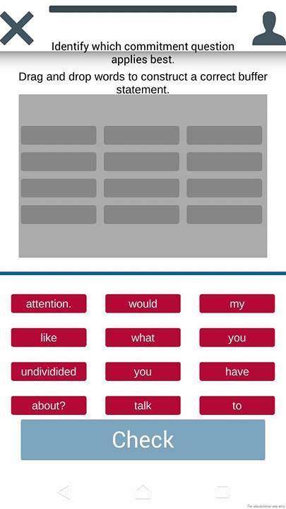
This is one of the different types of exercises within one area of the PROSPECT model. In each activity the banner has an exercise text to instruct on what the aim of this activity is. Underneath that is how to users are to interact with whats presented in order to complete the exercise. In this exercise there’s a blue line to separate where the answering zone is, and where the options are to make the answer. Answer zone is always on top, answer options always on bottom, and this is a convention carried through the app, with the exception of some special case exercises that can’t use this convention. The answer slots are greyed out the same shape as the answers.
Unlike in Duolingo like I mention [here], we’ve made sure that the first word of each sentence isn’t capitalized to reveal which answer it is.
And without describing every single process we’ve gone through to construct the UI in this New Intelligence app, I think that’ll suffice on some of the techniques I’ve learnt and the application in this app. These are very strong foundations and I plan to keep using these in future projects.
Thank you for reading, and I hope that some of the things I’ve discussed or learnt to help me in my journey also help you.
Until next time –
Bibliography
Willenskomer, I. Creating Usability with Motion: The UX in Motion Manifesto. Medium. Retrieved from https://medium.com/ux-in-motion/creating-usability-with-motion-the-ux-in-motion-manifesto-a87a4584ddc
 Nic Lyness